YouTube Videos
When given a YouTube iframe script, use the iframe16x9 snippet in VSCode for better results.
Replace "IFRAME_SOURCE" with the YouTube URL and "IFRAME_TITLE" with the video title.
This guide provides comprehensive instructions for migrating content to the DealerOn platform. It covers different page types, best practices, and tools to ensure successful content migrations while maintaining brand compliance and accessibility standards.
DealerOn sites are made up of a combination of page types, including: platform, inventory, OEM pages, and custom content.
Platform pages are controlled by our DEV team and provide core dealership functionality. While most of these pages have fixed layouts, Design can make specific edits like adding custom content above or below the platform content, and in some cases modify the content within designated editable regions.
Inventory pages are controlled by our DEV and Data teams. Design can make simple edits like tweaking CSS and adding content above and below the inventory feeds.
/searchnew.aspx - New Vehicle Search/searchused.aspx - Used Vehicle Search/searchnewv.aspx - New Virtual Inventory Search/searchusedv.aspx - Used Virtual Inventory Search/new- - New Vehicle Details (URL continues with vehicle-specific information)/used- - Used Vehicle Details (URL continues with vehicle-specific information)/specs- - Virtual Vehicle Details (URL continues with vehicle-specific information)/showroom.aspx - Vehicle Showroom/quote.aspx - Quick Quote Request/trade.aspx - Trade-In Appraisal/testdrive.aspx - Schedule Test Drive (New Vehicles)/testdrive.aspx?type=Used - Schedule Test Drive (Used Vehicles)/findmycar.aspx - Vehicle Finder Service/build.aspx - Vehicle Configuration Tool/specials.aspx - All Current Specials/newspecials.aspx - New Vehicle Specials/usedspecials.aspx - Pre-Owned Vehicle Specials/service-parts-specials.aspx - Service & Parts Specials/service.aspx - Service Department (Editable content page)/orderparts.aspx - Parts Order Form/serviceappmt.aspx - Service Appointment Scheduling/finance.aspx - Finance Department (Editable content page)/preapproved.aspx - Credit Application/paymentcalc.aspx - Payment Calculator/staff.aspx - Staff Directory/aboutus.aspx - About Us (Editable content page)/contactus.aspx - Contact Information/hours.aspx - Hours & Directions/careers.aspx - Employment OpportunitiesThese pages are built by Design to be shared across multiple dealerships. They are stored in the CMS's OEM Page Manager and synced to sites. We cannot make site-by-site edits without unsyncing the page. Other OEM pages come in the form of a replacement code that populates code stored on our FTP.
These page types will be addressed in separate trainings. They are built on interfaces (custom and Wordpress) that allow non-coders to create pages. Design helps with these pages when the Implementation team does not have bandwidth.
The remaining content on an automotive site will be added as Custom Pages. The initial set up of these custom pages when a dealer joins our platform is executed in a Content Migration case. The content is pulled from pages on their old "reference" site and built out on our platform, often with an improved layout and look and feel.
Replacement codes here are variables wrapped in # symbols (like #DEALERNAME#) that
automatically pull information from our DealerOn Content Management System (CMS). They're used to maintain
consistent dealer information across a website without manual updates.
A practical example:
<p>Visit #NAME# at #ADDRESS# or call us today!</p>Could display as:
<p>Visit Rothbard Chevy at 123 Main St, Cleveland, OH 12345 or call us today!</p>The key benefits are:
For a comprehensive index of all available platform replacement codes, refer to the Platform Replacement Codes Knowledge Article (Salesforce login required).
#NAME# or #DEALERSHIP_NAME# - Dealership Name.#NAME# to replace shortened
versions of the dealership name (e.g., replacing 'Bobs' with 'Bobs Cadillac'). However, if the name is
significantly different or includes generic terms (e.g., 'Bob's Auto Service Shop'), it's better to
hardcode it rather than using the replacement code.
#ADDRESS# - Complete Address from Dealer Info > Address.#STREET# - Street.#CITY# - City.#STATE# - State.#ZIP# - ZIP Code. This does not include ZIP+4.#DEALERMAKE# - Displays the Primary Make as configured in Admin Tools Page > Admin Tools.%(MAKES) - Dealership Makes.%(MAKES) when the make
is part of a specific model name (e.g., "Chevrolet Silverado 1500"). Use it in isolated sentences or
contexts where just the make(s) are needed.
These replacement codes output both the phone number and its corresponding label.
#PHONE# or #PHONE1# - Outputs the label and number for Phone 1 as listed in
Dealer Info > Phone Numbers.#PHONE2# - Outputs the label and number for Phone 2.#PHONE3# - Outputs the label and number for Phone 3.#PHONE4# - Outputs the label and number for Phone 4.#PHONE5# - Outputs the label and number for Phone 5.#PHONE6# - Outputs the label and number for Phone 6.#PHONE7# - Outputs the label and number for Phone 7.#PHONE8# - Outputs the label and number for Phone 8.#FAX# - Outputs the Fax label and number as listed in Dealer Info > Phone Numbers.These values are pulled from Dealer Info > SEO.
%(BIG_CITY1) - City 1%(BIG_CITY2) - City 2%(BIG_CITY3) - City 3%(BIG_CITY4) - City 4%(BIG_CITY5) - City 5When building custom internal pages with a bottom/footer section featuring maps and/or contact information, you can utilize special replacement codes that populate an all-in-one Contact block.
There are 3 different layout options available:
These codes are particularly useful for maintaining consistent contact information displays across the site while allowing for flexible layout options.
For a complete list of available contact block replacement codes and their layouts, refer to the Contact Block Replacement Codes Documentation .
Here are examples of the three layout options with Sales Hours:
<!-- Layout Option 1 with Sales Hours -->
#LOADCUSTOMFILE|Responsive|Production|Footer|Custom-Footer1-Hours-Sales#

<!-- Layout Option 2 with Sales Hours -->
#LOADCUSTOMFILE|Responsive|Production|Footer|Custom-Footer2-Hours-Sales#

<!-- Layout Option 3 with Sales Hours -->
#LOADCUSTOMFILE|Responsive|Production|Footer|Custom-Footer3-Hours-Sales#
Don't override font families, colors, sizes, or spacing. Styling for elements like <p>,
<h1>, <h2>, etc. are already built in to our OEM Styles.
Targeting generic or wide-reaching elements like body or ul can inversely affect
things in the Header, Footer, or Bonus Block elements. Make sure any custom CSS is only targeting what's in
the Custom HTML for that specific page.
Use color classes (ex. text-white, text-cta, text-muted) rather than
manual CSS.
Use padding and margin classes (ex. pad-3x, pad-vert-2x,
margin-bottom-x) rather than manual CSS.
Don't override style-specific color classes (anything with main or cta). This is
important for avoiding compliance issues.
Don't over-complicate styling if it's not needed. Our newly-migrated pages aren't obligated to match a reference page's padding, width, font sizes, etc. exactly. If you happen to be given specific instructions to closely match a reference layout, you're free to do more custom CSS to get something looking as intended, but for most general migration situations, our built-in headings/cta/container/etc. classes are the best option to use.
Using the built-in fonts and colors is also especially important for certain OEMs that are very strict about branding compliance. If this results in the new page not being able to totally match the reference page visually, that's fine.
When creating pages, designers have flexibility to improve and simplify content while maintaining brand standards and usability.
If the <h1> is really wordy, just keep the <h1> already populated in
the DealerOn page. There's no need to recreate overly complex headings when a simpler approach would be more
effective.
Make use of heroTemplates when building pages. Pages do not need to be a 1:1 creation from the reference site. Content can be simplified and improved based on the designer's discretion. Don't feel like you need to recreate the page or copy the design exactly as it appears on the reference site.
When building pages, focus on implementing:
Custom Form <script> tags can stay with the HTML and do not need to go in the body
bottom. This helps maintain the connection between form markup and its associated functionality.
Padding options include all sides, vertical, horizontal, and isolated to each direction (top, right, bottom, left). Padding sizes vary from .5em to 4em.
pad_5x = .5empad-1x = 1empad-2x = 2empad-3x = 3empad-4x = 4empad-x = no paddingNOTE: Class for list items should be placed on the UL or OL element, not the LI.
Padding on all sides, around each LI item.
.list-pad_5x .list-pad-1x .list-pad-2x .list-pad-3x .list-pad-4x
List with 1em padding on each side of the list item (not ul). (.list-pad-1x)
.list-pad-vert-x .list-pad-vert_5x .list-pad-vert-1x .list-pad-vert-2x .list-pad-vert-3x
              .list-pad-vert-4x
List with 1em padding on top and bottom of the list item (not ul). (.list-pad-vert-1x)
.list-pad-horz-x .list-pad-horz_5x .list-pad-horz-1x .list-pad-horz-2x .list-pad-horz-3x
              .list-pad-horz-4x
List with 1em padding on left and right of the list item (not ul). (.list-pad-horz-1x)
.list-pad-top-x
.list-pad-top_5x
.list-pad-top-1x
.list-pad-top-2x
.list-pad-top-3x
.list-pad-top-4x
.list-pad-bottom-x
.list-pad-bottom_5x
.list-pad-bottom-1x
.list-pad-bottom-2x
.list-pad-bottom-3x
.list-pad-bottom-4x
.list-pad-left-x
.list-pad-left_5x
.list-pad-left-1x
.list-pad-left-2x
.list-pad-left-3x
.list-pad-left-4x
.list-pad-right-x
.list-pad-right_5x
.list-pad-right-1x
.list-pad-right-2x
.list-pad-right-3x
.list-pad-right-4x
List with 1em padding on top of the list item (not ul). (.list-pad-top-1x)
Padding on all sides.
.pad_5x .pad-1x .pad-2x .pad-3x .pad-4x
Item with 1em padding on each side of the item item. (.pad-1x)
.pad-vert-x .pad-vert_5x .pad-vert-1x .pad-vert-2x .pad-vert-3x .pad-vert-4x
Item with 1em padding on top and bottom of the item item. (.pad-vert-1x)
.pad-horz-x .pad-horz_5x .pad-horz-1x .pad-horz-2x .pad-horz-3x .pad-horz-4x
Item with 1em padding on left and right of the item item. (.pad-horz-1x)
.pad-top-x
.pad-top_5x
.pad-top-1x
.pad-top-2x
.pad-top-3x
.pad-top-4x
.pad-bottom-x
.pad-bottom_5x
.pad-bottom-1x
.pad-bottom-2x
.pad-bottom-3x
.pad-bottom-4x
.pad-left-x
.pad-left_5x
.pad-left-1x
.pad-left-2x
.pad-left-3x
.pad-left-4x
.pad-right-x
.pad-right_5x
.pad-right-1x
.pad-right-2x
.pad-right-3x
.pad-right-4x
Item with 1em padding on top of the item. (.pad-top-1x)
.pad-x
.pad-x
Removes all padding (.pad-x)
Margin options include all sides, vertical, horizontal, and isolated to each direction (top, right, bottom, left). Margin sizes vary from .5em to 4em.
margin_5x = .5emmargin-1x = 1emmargin-2x = 2emmargin-3x = 3emmargin-4x = 4emmargin-x = no margin.margin-auto
Centers content within a section - best used to center images.
.margin-auto { margin-left: auto; margin-right: auto}
NOTE: Class for list items should be placed on the UL or OL element, not the LI.
Margin on all sides, around each LI item.
.list-margin_5x .list-margin-1x .list-margin-2x .list-margin-3x .list-margin-4x
List with 1em margin on each side of the list item (not ul). (.list-margin-1x)
.list-margin-vert-x .list-margin-vert_5x .list-margin-vert-1x .list-margin-vert-2x .list-margin-vert-3x
              .list-margin-vert-4x
List with 1em margin on top and bottom of the list item (not ul). (.list-margin-vert-1x)
.list-margin-horz-x .list-margin-horz_5x .list-margin-horz-1x .list-margin-horz-2x .list-margin-horz-3x
              .list-margin-horz-4x
List with 1em margin on left and right of the list item (not ul). (.list-margin-horz-1x)
.list-margin-top-x
.list-margin-top_5x
.list-margin-top-1x
.list-margin-top-2x
.list-margin-top-3x
.list-margin-top-4x
.list-margin-bottom-x
.list-margin-bottom_5x
.list-margin-bottom-1x
.list-margin-bottom-2x
.list-margin-bottom-3x
.list-margin-bottom-4x
.list-margin-left-x
.list-margin-left_5x
.list-margin-left-1x
.list-margin-left-2x
.list-margin-left-3x
.list-margin-left-4x
.list-margin-right-x
.list-margin-right_5x
.list-margin-right-1x
.list-margin-right-2x
.list-margin-right-3x
.list-margin-right-4x
List with 1em margin on top of the list item (not ul). (.list-margin-top-1x)
Margin on all sides.
.margin_5x .margin-1x .margin-2x .margin-3x .margin-4x
Item with 1em margin on each side of the item item. (.margin-1x)
.margin-vert-x .margin-vert_5x .margin-vert-1x .margin-vert-2x .margin-vert-3x .margin-vert-4x
Item with 1em margin on top and bottom of the item item. (.margin-vert-1x)
.margin-horz-x .margin-horz_5x .margin-horz-1x .margin-horz-2x .margin-horz-3x .margin-horz-4x
Item with 1em margin on left and right of the item item. (.margin-horz-1x)
.margin-top-x
.margin-top_5x
.margin-top-1x
.margin-top-2x
.margin-top-3x
.margin-top-4x
.margin-bottom-x
.margin-bottom_5x
.margin-bottom-1x
.margin-bottom-2x
.margin-bottom-3x
.margin-bottom-4x
.margin-left-x
.margin-left_5x
.margin-left-1x
.margin-left-2x
.margin-left-3x
.margin-left-4x
.margin-right-x
.margin-right_5x
.margin-right-1x
.margin-right-2x
.margin-right-3x
.margin-right-4x
Item with 1em margin on top of the item. (.margin-top-1x)
.margin-x
.margin-x
Removes all margin (.margin-x)
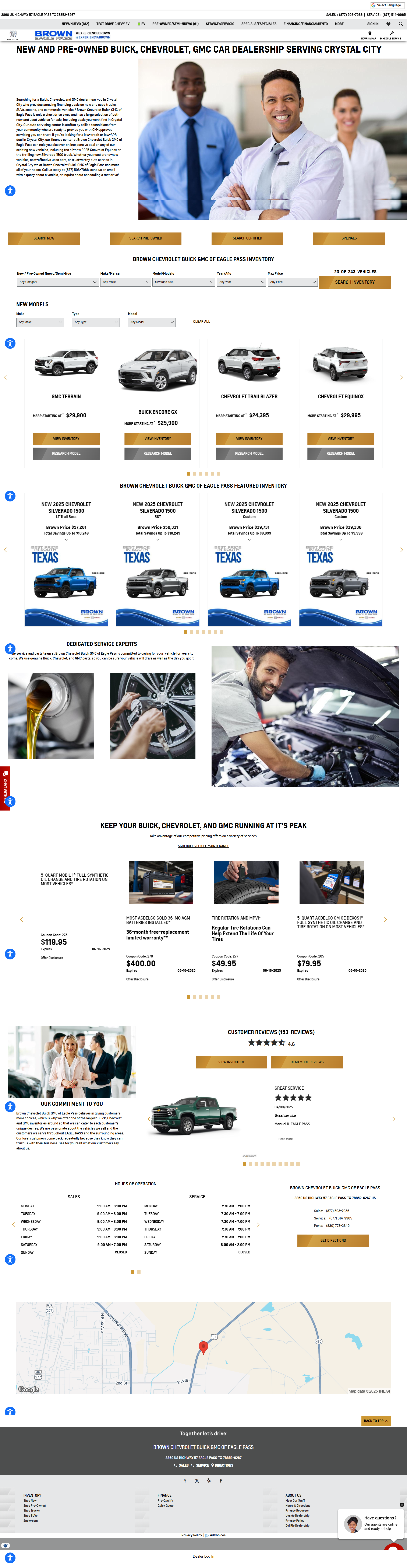
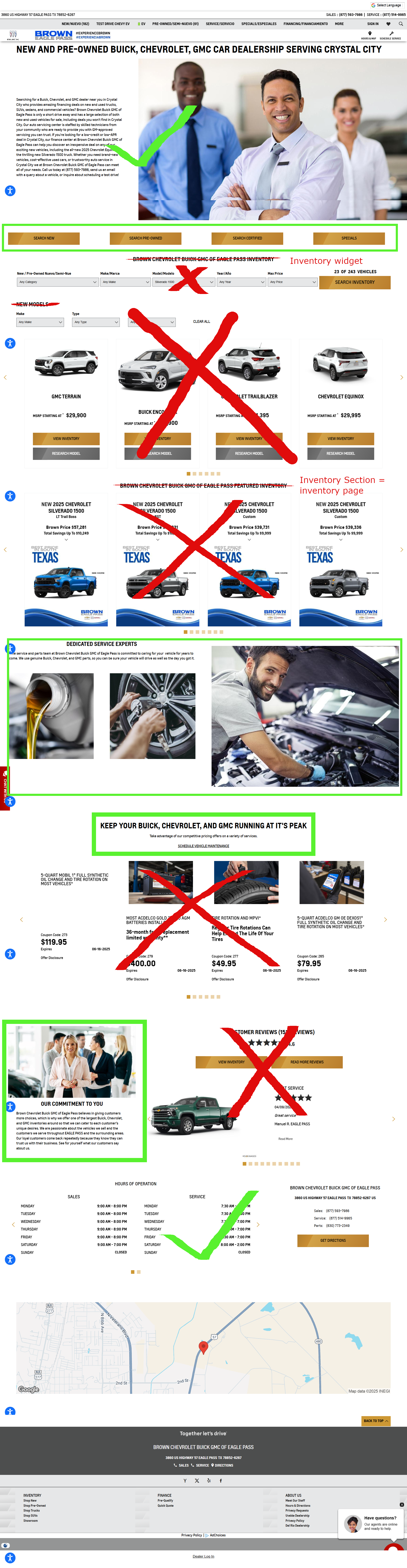
Even if these are requested in a case, do not migrate: staff pages, specials, inventory feeds, hard-coded reviews, or video files that aren't embeds.
Project Coordinators can use our platform /staff.aspx to execute Staff pages. This is not a
page that should be sent to Design. If it is, skip and leave a note when closing the case.
A Specials feed should never be hardcoded. Instead, you can add a CTA to the Specials page. The same rules
apply for Inventory feeds - these should not be hardcoded; you can link to inventory pages like
/searchnew.aspx instead.
Our search widgets only work on the homepage. Please don't attempt to add them to internal pages.
Reviews should be populated by a script. If you're requested to build out a custom page with review content and no script has been provided, please push back and request one from the Project Coordinator.
This section provides answers to frequently asked questions and instructions for handling special situations in Design cases.
When given a YouTube iframe script, use the iframe16x9 snippet in VSCode for better results.
Replace "IFRAME_SOURCE" with the YouTube URL and "IFRAME_TITLE" with the video title.
For OEM sites, fonts should be restricted to approved options. If a custom font is insisted upon, consult a Design team lead for further evaluation.
While full version control is in development, use CMS Tracking to find previous versions of content blocks (CMS Tracking Tool SKB). Note that the tracking system may require multiple attempts with different search criteria.
Use #GMAP# replacement code by default for homepages. For static image requests (often for
site speed):
Instead of using blanket overflow: hidden, identify and fix specific causes:
row class inside container-fluid - either change to
container or add margin-horz-x to the row
overflow-x: hidden; to that
specific section as last resort
Ensure correct Design group is selected in Layout Setup dropdown (typically "37: Responsive – OEM/DealerSpecific"). Check reference site's group if unsure.
Add ?om=1 to URL to enable Override Minimize, allowing browser inspection tools to identify
specific stylesheets for CSS properties.
For consistent desktop width and full mobile width, combine btn-block with Bootstrap columns.
Reference this example.
Access Privacy Policy under Content -> Privacy Policy in CMS. Options include adding custom content above/below default content or opting out of default content entirely.
For matching heights in desktop view, combine flex with media-queried width. Reference this example.
Manage redirects in CMS under Admin Tools -> URL Redirects. While Design team doesn't create redirects, understanding how to remove incorrect ones is important. Consult Case Contact or Team Lead if unsure about removing a redirect.
For replacement code issues in bottom Custom HTML block, "reset" styling by adding heading text above the replacement code.
Add extra content above/below Staff listings using Body Section Bottom block with jQuery placement, as Custom HTML blocks aren't displayed on staff.aspx pages.
Official requirement: Test responsiveness down to 360px window width. Best practice: Test to 320px for broader device compatibility.
For lengthy headings, consider splitting into heading/subheading format using classes like
heading-xl, heading-lg, h1. Example:
<!-- Instead of -->
<h1>#NAME# - Auto Repair and Service Center You Can Depend on at #CITY#</h1>

<!-- Use -->
<h1 class="heading-lg">#NAME#</h1>
<h2 class="margin-top-x margin-bottom-1x">Auto Repair and Service Center You Can Depend on at #CITY#</h2>data-dotagging-element-order="0"
data-dotagging-event-action-result attribute, use these standardized values:
When implementing GA4 tracking for links and interactive elements, use the following standardized values for the `data-dotagging-event-action-result` attribute:
| Value | Usage |
|---|---|
open |
For links that stay within the same tab |
redirect |
For external links that open in a new tab or window |
open |
For links to a default SRP with no search query (e.g., /searchnew.aspx) |
search |
For links to an SRP with a search query (e.g., /searchnew.aspx?Make=Toyota&Model=~Supra)
|
The following examples can be used as a starting reference when adding GA4 tagging.
The tags that are needed in each case have been extracted and listed out to show the hierarchy of which ones can be added at a higher parent level vs. which ones will need to be added to each unique instance of an element.
Elements increment (0, 1, 2...) when they are:
Think of containers like different rooms in a house - each room has its own purpose and organization. The main containers are:
.row elementsJust like starting a new chapter in a book, we reset to 0 when:
The following snippets are available in VS Code to quickly add GA4 tagging to your elements. Use the prefix commands to insert them.
ga4-hyperlink-open - For links that stay in the same tabga4-hyperlink-search - For search result linksga4-hyperlink-redirect - For external links that open in new tabsExample of a standard hyperlink (ga4-hyperlink-open):
<a href="SOURCE"
   data-dotagging-link-url="SOURCE"
   data-dotagging-event="cta_interaction"
   data-dotagging-product-name="Website|Custom Content"
   data-dotagging-event-action-result="open"
   data-dotagging-element-type="body"
   data-dotagging-element-order="0"
data-dotagging-element-subtype="hyperlink">CONTENT</a>ga4-cta-open - For CTAs that stay in the same tabga4-cta-search - For search-related CTAsga4-cta-redirect - For external CTAs that open in new tabsExample of a CTA button (ga4-cta-open):
<a href="SOURCE"
   class="btn btn-cta"
   data-dotagging-link-url="SOURCE"
   data-dotagging-event="cta_interaction"
   data-dotagging-product-name="Website|Custom Content"
   data-dotagging-event-action-result="open"
   data-dotagging-element-type="body"
   data-dotagging-element-order="0"
data-dotagging-element-subtype="cta_button">CONTENT</a>ga4-img-open - For image links that stay in the same tabga4-img-search - For search-related image linksga4-img-redirect - For external image links that open in new tabsExample of an image link (ga4-img-open):
<a href="SOURCE"
         data-dotagging-link-url="SOURCE"
         data-dotagging-event="media_interaction"
         data-dotagging-product-name="Website|Custom Content"
         data-dotagging-event-action-result="open"
         data-dotagging-element-type="body"
         data-dotagging-element-text="Alt Text"
         data-dotagging-element-order="0"
         data-dotagging-element-subtype="image">
        <img src="images/promo.jpg"
         alt="Alt Text"
         class="img-responsive margin-auto"
         loading="lazy" decoding="async">
</a>ga4-phone - For click-to-call phone numbersExample of a phone link:
<a href="tel:#PHONE1-MOBI-DIGITS#"
         data-dotagging-product-name="Website|Custom Content"
         data-dotagging-comm-phone-number="tel:#PHONE1-MOBI-DIGITS#"
         data-dotagging-element-type="body"
         data-dotagging-event-action-result="redirect"
         data-dotagging-element-order="0"
         data-dotagging-element-subtype="hyperlink"
         data-dotagging-event="click_to_call">
         #Phone-Number#
</a>element-order should start at 0 and increment for each similar element in a group.
target="_blank" rel="noopener noreferrer" for
security best practices.
The following tools and utilities help streamline the development process and ensure consistent code quality across projects.
VS Code snippets can significantly speed up content migration by providing reusable code templates. DealerOn maintains official snippets to ensure consistency across projects.
Provides a clean layout structure with minimal elements, perfect for building custom pages.
Includes the same layout as heroTemplate but comes with pre-populated elements such as CTAs, phone numbers, dealer name, etc.
<div class="accordion pad-top-1x">
        <div class="accordion-item">
      <div class="accordion-question pad-1x">
        <h4>QUESTION 1</h4>
        <i class="fa fa-plus-circle margin-left-1x" aria-hidden="true"></i>
      </div>
      <div class="accordion-answer pad-1x">
        <!-- Place your answer content here -->
      </div>
        </div>
        <div class="accordion-item">
      <div class="accordion-question pad-1x">
        <h4>QUESTION 2</h4>
        <i class="fa fa-plus-circle margin-left-1x" aria-hidden="true"></i>
      </div>
      <div class="accordion-answer pad-1x">
        <!-- Place your answer content here -->
      </div>
        </div>
        <div class="accordion-item">
      <div class="accordion-question pad-1x">
        <h4>QUESTION 3</h4>
        <i class="fa fa-plus-circle margin-left-1x" aria-hidden="true"></i>
      </div>
      <div class="accordion-answer pad-1x">
        <!-- Place your answer content here -->
      </div>
        </div>
      </div>
      <script>
        $(document).ready(function () {
      $(".accordion-question").click(function () {
        const answer = $(this).next(".accordion-answer");
        const icon = $(this).find(".fa-plus-circle");
        $(".accordion-answer").not(answer).slideUp(300);
        $(".fa-plus-circle").not(icon).removeClass("rotate");
        answer.slideToggle(300);
        icon.toggleClass("rotate");
      });
        });
</script><div class="embed-responsive embed-responsive-16by9">
<iframe class="embed-responsive-item"
src="IFRAME_SOURCE?rel=0&wmode=transparent"
title="IFRAME_TITLE"
frameborder="0"
allowfullscreen>
</iframe>
</div><div class="embed-responsive embed-responsive-4by3">
<iframe class="embed-responsive-item"
src="IFRAME_SOURCE?rel=0&wmode=transparent"
title="IFRAME_TITLE"
frameborder="0"
allowfullscreen>
</iframe>
</div><div class="row flex-center-md">
<div class="col-md-6 col-md-push-6">
<div role="img" aria-label="#NAME# in #CITY# #STATE#" style="background-image: url('IMAGE_SOURCE');" class="img-background img-cover"></div>
</div>
<div class="col-md-6 col-md-pull-6">
<div class="margin-top-2x visible-xs visible-sm"></div>
<!-- Place your text content here -->
</div>
</div>DealerOn uses Bootstrap 3 as its foundation, enhanced with custom classes through Extend.css. These extensions provide additional functionality while maintaining compatibility with Bootstrap's core features.
pad-1x through pad-5x - Standardized padding incrementspad-vert-1x through pad-vert-5x - Vertical padding onlypad-horz-1x through pad-horz-5x - Horizontal padding onlymargin-1x through margin-5x - Standardized margin incrementstext-main, text-cta - Brand-compliant text colorsbg-main, bg-alt1, bg-alt2 - Brand-compliant background colors
{
    "DealerOn Container": {
    "prefix": "do-container",
    "body": [
    "<div class=\"container\">",
    "  <div class=\"row\">",
    "    <div class=\"col-12\">",
    "      $1",
    "    </div>",
    "  </div>",
    "</div>"
    ],
    "description": "Basic DealerOn container structure"
  }
}
Emmet is built into VS Code and can dramatically speed up HTML/CSS writing. Here are some useful Emmet shortcuts for content migration:
Reference the complete Emmet Cheat Sheet for all available shortcuts.
container>row>col-12 → Basic Bootstrap gridul>li*3 → Unordered list with 3 items.text-main+.text-cta → Common text classessection.pad-3x>h2{Section Title}+p.text-mainThis expands to a common section structure with proper padding and text classes.
CSS minification is the process of removing unnecessary characters such as whitespace, comments, and formatting from CSS files. This results in smaller file sizes and faster load times.
For CSS minification, use:
Bookmark scripts (bookmarklets) can enhance CMS navigation and content migration workflow. Here are some useful examples:
Access our collection of useful bookmark scripts in the DealerOn Bookmark Scripts Documentation .
An Image Downloader browser extension can be useful for extracting images from reference websites in their original format and quality. This helps ensure you are using the best available assets for migration. One popular option is Image Downloader - Imageye for Chrome. Search the extension store for your browser (Chrome, Firefox, etc.) for other available options.
The WAVE Browser Extension is a free tool for quick accessibility checks. While not as comprehensive as professional testing services, it helps ensure basic accessibility standards are met.
The WebAIM Contrast Checker helps adjust color combinations to meet AA accessibility standards. Use this tool to verify and adjust color combinations until they achieve the required contrast ratio.
Replace generic alt text like "#NAME# in #CITY# #STATE#" with descriptive content that explains the image, such as "Toyota Corolla driving down a highway" or the actual text content within the image.
Decorative background videos require descriptive text, similar to alt text for images. Add a screen-reader-only paragraph below the video element:
<video src="intro.mp4" autoplay loop muted></video>
<p class="sr-only">The above video shows a silver Toyota Camry driving through a city at sunset.</p>Never use display: none; on form labels - this causes accessibility errors. Instead:
sr-only class to visually hide labels while maintaining screen reader accessibility
<div class="form-group">
  <label for="email" class="sr-only">Email Address</label>
  <input type="email" id="email" class="form-control" required>
</div>We must be mindful of copyright when adding images to our sites. Do not arbitrarily bring over all images from the reference site. See below for guidelines.
Images that are clearly sourced from the dealer can be migrated over to the local media gallery. An example would be an exterior shot of a dealership, a picture of their staff or service center, etc.
To keep the media gallery organized, please create a folder called custom-pages and then a subfolders for each page you need to upload images for.
As necessary for best page speed, resize and compress images. Our media gallery accepts a variety of formats, including: .svg, .webp, .png, and .jpg.